
I am sure by now everyone is aware that the Metropolitan Museum of Art in New York’s next costume exhibition will feature Rei Kawakubo and Comme des Garçons, only the second living designer to be so honored, the first was Yves Saint Laurent. CDG is a most interesting choice not only because the creative genius behind the label is extremely reclusive but the designs have always been controversial, in many cases, very extreme sometimes unwearable (until you look at the individual pieces!) There has been and will be numerous articles written about the upcoming exhibition, which opens on May 4th and runs through September 4th, with the Party of the Year on Monday, May 1st. In the meantime, you can see some of Kawakubo’s genius displayed in the Merce Cunningham exhibition at the Museum of Contemporary Art in Chicago, but you must hurry it is closing on Sunday, April 30th.
 A shot from the Merce Cunningham exhibition featuring some pieces from Comme des Garçons designs for one of the Cunningham magical dance pieces.
I am not going to attempt to analyze the designer, the Fall 2017 collection nor the exhibition obviously I haven’t seen it. What I wanted to talk about today are the Japanese designers I have worked with over the years.
First up, Hanae Mori.
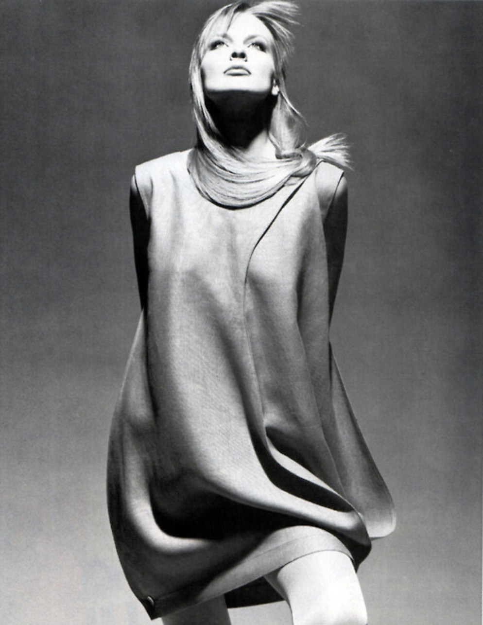
 Richard Avedon photograph
I worked with her in the 1970’s at a show to benefit the Illinois Children’s Home and Aid Society, always the first social event of the fall season and always a black tie evening event. We, Saks Fifth Avenue, Chicago, had produced this event for many years (actually it was the first major show I worked on when I started in the fashion office and we showed the Sophie of Saks Collection for many years until she no longer designed). Mrs. Mori was the first designer after Sophie that we featured. I remember she and her husband, Ken, were staying with hosts in the Northern suburbs and I went to their home to meet the Moris. They couldn’t have been more charming and gracious. Mrs. Mori spoke very little English, her husband translated for her. The collection we featured was bold in color and pattern, most certainly inspired by the Japanese culture, the kimono, and flowers, all done in silk. All her fabrics were woven, printed and dyed especially for her and the Japanese symbols of feminity…butterflies and flowers…were used extensively in her prints which you can see in the two photos illustrated below. It was truly magnificent and very well received by the audience. She was the first Japanese woman to show on the runways in Paris and New York, in 1977 she took her couture collection to Paris and was the first Japanese woman to be elected to the Chambre Syndicale de la Haute Couture.
 Looks that would have been in the Show.
 Barbie in one our her especially made designer gowns, this evening costume from Hanae Mori.
 Kenzo in the 1970’s. Photo credit unknown.

 You can see the joyous color combinations and mix of print. Very innovative for the times. Look at today’s fashion and THE look is a mix of pattern and colors…everything old is back again!
Kenzo was a huge designer in the early 1970’s and we were very excited that he was coming to Chicago to present his collection. At the time I helped style the interiors and windows as well as doing all the fashion shows and special events. I loved dressing the mannequins and we had an amazing team headed by Joe and Alma Kreis. Henry Callahan, the Saks Corporate head of Visual, was the BIG name in the world of display, (aka visual merchandising), he did the White House Christmas decorations for years and years and there was no one more admired (and feared) or talented in the industry. Needless to say, when he came to Chicago we were all on our best behavior. For some unknown reason, he had taken me under his wing when we opened the Saks Fifth Avenue store in the Old Orchard Shopping Mall and we would always go to lunch when I was in New York. To make this long story even longer, Mr. Callahan and some of his New York assistants came to Chicago to oversee the installation of the windows for the Kenzo visit. We had many windows fronting Michigan Avenue (Saks was located at 669 North Michigan Avenue at that time) and we were featuring a very long (it went from one window to another) dragon to form the background for the extremely colorful prints that were a Kenzo trademark. We must have worked on the windows for a week until everyone was satisfied that they would be showstoppers….which they were! Again, Kenzo proved to be a gracious, fun-loving, hip designer of the swinging times. The event was a huge success and garnered Saks a new contemporary client along with the established society women of the time.
 The playfulness of Kenzo at the beginning of his career.
 A recent photo of the elegant Kenzo in front of his current love, painting, isn’t it glorious!
 One of my favorite books in my extensive fashion library. How clever that you can choose one of the four prints. Mine is the bold turquoise.
We were very fortunate, in Chicago, to have our own Japanese designers become superstars. Noriko Nishi, was born in Japan and moved to Chicago when she married Dan Chuzo Nishi. She had attended design school in Japan and continued her education at the Ray Vogue School of Design in Chicago (a story unto itself!!!) and made clothes for herself (a size 0) and her friends. Unfortunately, her husband was killed in a car accident in 1970 leaving Noriko, alone with her son, Michael, to start a career as a designer. I first met her just before Saks started carrying her exclusively (in 1972). She did her first shows in her apartment and did all her own floral arrangements which were pieces of art unto themselves and the invitations were all handmade origami, all of which were quite charming and extremely intricate. She was extremely talented and very shy. I think the industry was overwhelming to her and she needed support and guidance to help her understand she was something special. As her career progressed and grew, I produced her shows at the store as well as various other Chicago locations and included her colorful designs with other designers in many other shows, I always loved to showcase our exclusive designer collections. At the beginning, her garments were all silk matte jersey and her signature was trapunto detailing. A bit later she added gauzy cotton, wool challis and silk crepe de chine. All were very simple in look but very intricate in concept and the customers scooped them up. Unfortunately, I don’t have any photos of her or her garments, pity, they were amazing!!1

I worked with Hino and Malee when they were with Noriko and then when they went out on their own. Their esthetic was very Asian with clean lines, beautiful natural fabrics, and natural colors. Extremely wearable and, to a merchant, very salable.
 Hino and Malee in their heyday. They were devoted to each other and their designs were extraordinary. Not at all contrived just plain simple and elegant.
A dress from Hino and Malee photographed by the genius Victor Skrebneski!
What is this all about, it is about elegance, simplicity of line, joyful pattern, color and color combinations, (which the Asian eye sees differently that the Caucasian eye). It is about wearing clothes that are all about the person wearing the garment and becoming one with it, not the garment wearing the wearer…this has always been my personal code that I share with the Japanese designers, I have been fortunate to work with, a philosophy we all attest to.

 Two opaline sconces on one of the walls, this wall is on the side of my French daybed. You can see a little peek of one of my early needlepoint pieces, actually, Ruth drew the violets (her favorite flower) and I needlepointed it and framed in in an antique frame. Needlepoint with be a multi posting in the future. These sconces can be put together and form a chandelier. In my mind, I think we purchased these a zillion years ago at a Lake Forest Antique Show. They are two of my favorite things.
 A close up of one of the sconces.
 A companion chandelier hangs over my desk, where I write nenasnotes. The cord is covered in shirred apricot silk taffeta. You can see an oil on wood painting in a distressed ornate gilt frame which I look at each time I sit at my desk, and, of course, books that are on a vintage bamboo shelf, one of many, on my window ledge. The painting and shelf purchased at the Randolph Street Market. The April market is this Saturday and Sunday, April 29 and 30 from 10 to 5
 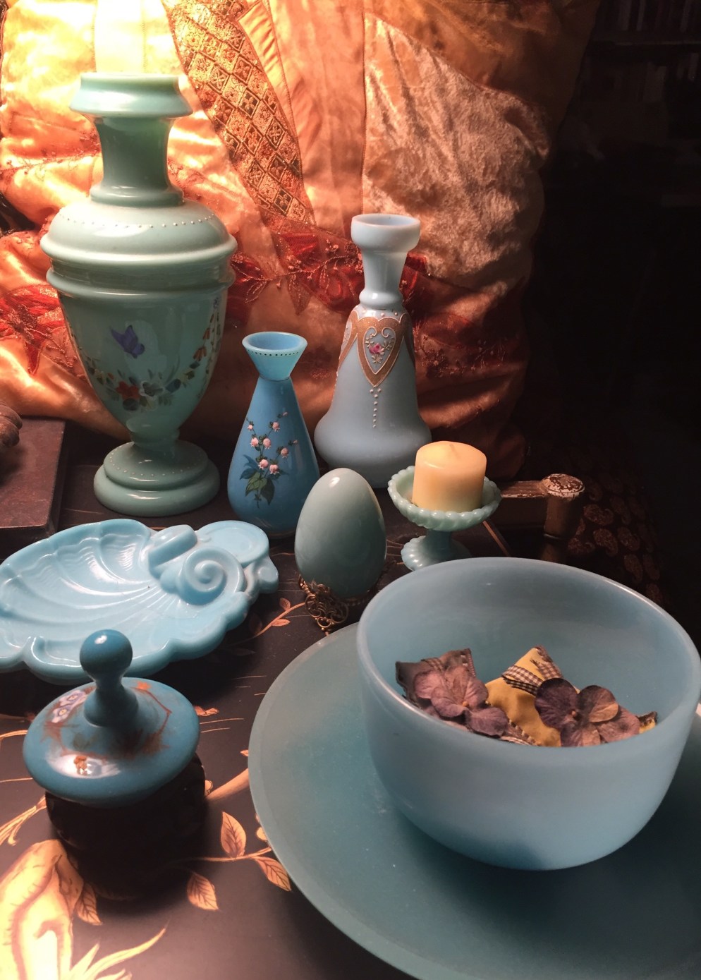 The remains of Mom’s blue collection, some opaline some milk glass most collected many, many years ago others I have recently added, these grouped together on top of one of my Chinoiserie file cabinets.
 Here a great example of the multitude of shades of blue (not gray!!!) in opaline and milk glass. Both vases are handpainted and again from Randolph Street Market. The box predates RSM.
 An apricot opaline base for a tiny lamp which sits on top of books, of course, it does! I imagine it was once a vase or candle holder, probably a pair. It has always been a lamp to me. The piece to the left is a beaded handpainted fabric and barely visable behind is a portion of a heavily appliqued lace curtain, both from RSM. My home is mostly green but I have accented it with shades of apricot as well as picking up colors from my paisley shawl collection and the pastels in my vintage Chindia rugs.
 A vignette of a portion of my green opaline collection. The tussie mussie holder encases an antique lace dollie and silk violets. Behind it is a collection of candle holders and the water color is from my trip to Russia. Under all a vintage handmade crazy quilt, another collection. I have a couple of full quilts as well as many remnants. All from the Randolph Street Market. Perhaps this might inspire you to mix and match your collections…as you know Victoriana is a passion of mine and the Victorians always felt more is more!!!! I most certainly agree. I think my opaline collection is what led me to start collecting Jadeite which I use as my everyday dishes and have posted an image of some of it on my kitchen shelves. You can find reams and reams of information on Jadeite, (which was cheap as chips when it was first manufactured and now commands very high prices, but you can find all manner of Jadeite at all prices at RSM), but not much on opaline, I couldn’t find a single book on the subject!!! Do let me know if you know of some.
 Very unusual color for opaline, a putty, handpainted with my favorite flower, lily of the valley. The small vase is a celadon green it also handpainted with lily of the valley. Both are one of a pair. The larger pair sits on either side on top of my breakfront and the small ones are placed in front of the lusters on top of my fireplace.
 Another pair, this time handpainted with beautiful English rose buds, forget me knot and lily of the valley…three of my favorite all on one vase, bonus! You can barely see the gilt dots at the base and around the top. They are on either side of the top of the drawer portion of the breakfront and hold dried tree hydrangea.
 A close up of the painting…I love its three-dimensional effect. All the above vases I have gotten at the Randolph Street Market and they have been collected over the years.
 One of my most favorite trees, we had one in our backyard in Evanston, I loved it…the weeping willow, always one of the first trees to show life that isn’t a flowering tree. It brings joy to my heart!
 A grove of weeping willows near a pond, they do love water. The only photo not taken in several friends yards and an estate.
 A magnificent old magnolia tree, the blooms last such a short time, but they are glorious!
 Another old tree, some kind of fruit tree, sorry don’t know if it is an apple or pear, who cares it is lovely.
 A dogwood tree, love the graceful shape of this against the sky and neighboring roof line.
 A weeping redbud tree, gorgeous in all seasons, but I particularly love it now in full bloom and in the summer when you can enjoy the heart shaped leaves. We had a standard redbud in our Evanston home’s front yard, it was always one of the first to bloom and reminded my Mother of her youth in Missouri, redbud country!
 The next volume is out now, I would suggest you read Death on the Sapphire first. Koreto has also written a series of Alice Roosevelt mysteries…need to get those as well, I am!
 Cammy Kelly in her modeling days (she absolutely looks the same today!).
 Nena’s note: A photo I had taken to be used for the front of an invitation for an evening gown collection show we did as a benefit for the Architecture Foundation of Chicago. Cammy is on the magnificent staircase in the lobby of the Railway Exchange Building (aka the Santa Fe Building!) where the Architecture Foundation of Chicago makes its home. I always began these shows (we did several there…a post, of course, at a future time) and with the models coming down the staircase and would end with them placed on the stairs for a dramatic finale. Photographer unknown.
 With Jeanouche and Lauren.
 Backstage with the modeling crew.
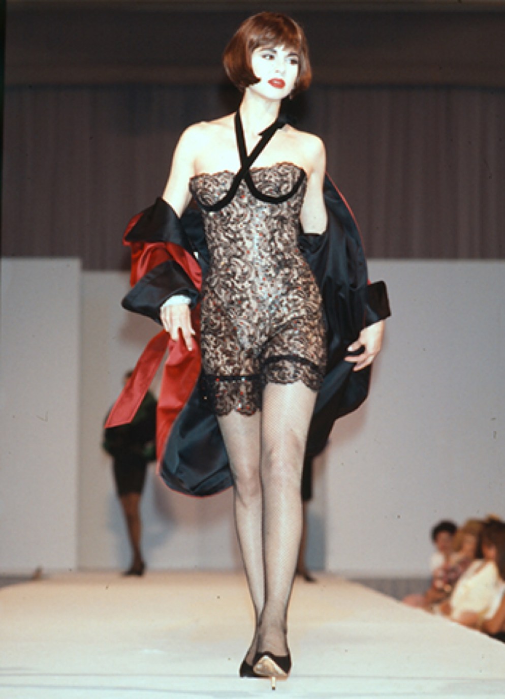
 The Cammy drama!
 Cammy in an embroidered lace gown.
 Another runway shot.
 Moose and Cammy…photo by Terry David Drew.
 Cammy today, what is with my models….they never age!!!!
 The entrance to the Chicago History Museum Costume Council’s Inspiring Beauty: Fifty Years of Ebony Fashion Fair exhibition, 2013-2014. Photo credit courtesy of the Chicago History Museum.
 Not the world’s best photo but here we are….Virginia Heaven and Joy Bivins the creative minds behind the exhibition flanking me, I was serving as President of the Costume Council at this time. Photo credit unknown, but taken with Nena’s iPhone.
 Photo courtesy of Gayle King.
 Not all the models in the Ebony Fashion Fair shows were sample sizes…here a “real woman” in a made to order gown from Bill Blass (A designer close to my heart and one I often worked with…more on him in an upcoming nenasnotes post!) Photo courtesy Chicago History Museum.
 From Emanuel Ungaro, the piece as shown in the exhibition…..photo courtesy Chicago History Museum.
 And on the stage, truly a work of art!. Photo credit unknown.
 An iconic piece from an iconic designer, Christian Lacroix. Photo credit unknown.
 Costume by Oscar de la Renta. Photo credit unknown.
 A detail of the Oscar de la Renta costume.
 A tongue in cheek garment by Patrick Kelly, always pushing the limits and creating imaginative garments. The “face” is all hand sewn buttons, his signature. I still have one of the buttons he gave me when he was in Chicago many years ago. He was a true talent and delightful to work with.
 Back of the Patrick Kelly gown, more buttons, made especially for the Fashion Scandal show. Photo credit unknown.
 Who else could it be….Bob Mackie, of course with all his drama perfect for the Ebony Fashion Fair shows and another favorite of Mrs. Johnson (this is the garment that I sponsored in the exhibition, I was thrilled!) Photo credit unknown.
 The finished tented ballroom on the grounds of the Chicago History Museum. Here you can see the king tables, each specially made for the event, as well as the smaller square tables. Small centerpieces down the center of the long tables and the upside down orchids encased in glass on the smaller tables. You can also see the drama of the fringed chandeliers.

 Drama as you entered for the gala….the model is wearing one of my favorite pieces from the archives in front of the entrance to the museum which we had draped in a beaded fringe curtain.
 Two images of models on the staircase leading to the museum’s second floor. Each model is holding a sign with the name of the designer and year of the show in which it appeared. Above photos taken by Bob Carl.
 An appropriate finale for this post! Photo courtesy the Chicago History Museum.
 From Sally Schwartz’s Collection, finds from the Randolph Street Market, her monthly treasure chest of goodies.
 Prior to being put in place, wonderful green and white Jasperware pieces…this part of the collection is in the butler’s pantry…see next photo for actual placement done with style and panache through the collective eyes and styling of the Heisters! Before and after photos provided by Linda Heister.
 Gorgeously placed in an antique secretary and on silver serving trays. These pieces are not just for ornamentation but are used for every day.
 A plaque in the style of Wedgwood in a gilt surround on the front of a wooden chest at last month’s Randolph Street Market. I found it charming. Photo by Nena with iPhone.
 More collections, “every day” place settings.
 More for entertaining…white place settings go with everything like the little black dress, don’t you agree….both photos by Linda Heister.
 More green Jasperware in the study. Several pieces are from the Randolph Street Market, that I gave the homeowners. Remember to mark your calendar for the next market, Saturday and Sunday, April 29 and 30 from 10 to 5
 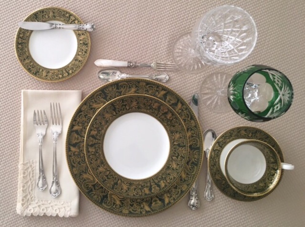 Beautiful place settings from Margaret Buckman, who started collecting her china at age 12. Margaret is a lover, like I am, of anything green. You read the post I did on Margaret and her incredible story of how she has lived her life of art. She has graciously done a place setting for me of her Green and Gold Florentine pattern and then took this photograph exclusively for nenasnotes! She tells me that there is a Pathé movie (see below), from the 1950’s, showing the making of Wedgwood at their factory and the artisans were hand painting her dishes in the film.
 From the Egyptian Collection. Love the combination of color.
 Too chic for words…I want this one!
 This might change my mind for blue and white!
 A tie-in to yesterday’s daffodil posting….truly beautiful.
 Again, should I rethink my blue aversion, could be added to my Victorian jewelry collection!
 My most favorite piece of all, magnificent, I WANT it!
 I leave you with a sampling of some of the many colors of Jasperware.
 No words today just pretty daffodils….a field full of them!!! Enjoy……


 And in a bouquet in my house.
 The cover of the Inspiring Beauty: 50 Years of Ebony Fashion Fair exhibition catalog.
 Eunice Johnson at work.
 Joy Bivins, in the exhibition.
 Karl Lagerfeld for Chloé Fall/Winter Prêt à Porter 1983-1984. I worked with this exact iconic garment ” The Showerhead Gown” when Saks Fifth Avenue, Chicago presented the Chloé trunk show that season. We had the Chloé trunk shows, both Spring and Fall for several years, unfortunately not with M. Lagerfeld, always to rave reviews by clients and press.
 Mrs. Johnson with Karl Lagerfeld during his Chloé days.
 An extravagant ensemble from the creative genius, Bob Mackie, a designer I worked with on many formal extravaganzas.
 Mrs. Johnson working with the extraordinary Yves Saint Laurent at his desk.
 Gayle King’s composite.
 Gayle wearing a Jacqueline de Ribes evening piece in an in store Saks Fifth Avenue, Chicago benefit fashion show.
 Gayle wearing Adolfo.
 Gayle in a “glamour” shot last year…still has it wouldn’t you agree!!! Photo credit Ernest Collins
 Gayle today, still with that memorizing smile and the endearing personality. Thank you, Gayle, for being you!